 When the London newsroom of the Guardian was reorganised recently, the ‘visuals desk’, producing infographics and data projects, became a key part of its digital operation, together with the ‘news desk’, ‘live desk’ and ‘audience’. While not every news organisation shows a similar enthusiasm when it comes to integrating the production of editorial articles and data visualisations, the Guardian’s example illustrates the growing enthusiasm for visual storytelling in newsrooms around the world.
The disclosure of big data and the increasing focus on visual language has prompted journalists’ interest in visualisations. Newsrooms are hiring more designers and experimenting with new forms of visual storytelling.
But while information visualisations seem to have gained a permanent place in the newsroom, most legacy media are finding that in practice, matching news stories with visualizations is difficult.
Our recent paper, Working with, or next to eachother? Boundary crossing in the field of information visualisation is based on an intensive ethnographic research. We analysed the production process of a number of editorial visualisations and saw that a strained collaboration between designer and journalist often prevents newspapers from producing effective visualisations.
A mismatch between article and visual
Designers have difficulty applying journalistic principles to their visualizations, while in turn, journalists lack experience in adapting design rules to their stories.
One designer told us: “Journalists come with impossible questions, [for example asking us] to visualize abstract concepts like ‘randomness’ or ‘inborn capacities.’”
We also learnt that journalists are sometimes appalled by the simplistic visual solutions of designers. “They never surprise me with their graphs,” one journalist complained. “They always come up with something I already had in mind.”
Visualizations are generally considered to be mere support for news stories. First comes the story, then the graphic. Designers are seldom involved in the news production, instead they are more often merely asked to execute what journalists ask for.
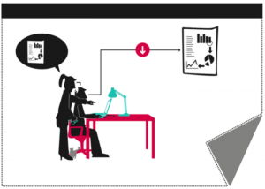
A designer described the hierarchal difference as follows: “The typical way of a journalist consulting us is that he stands behind my desk, looking over my shoulder, while I sit behind my computer and try to visualise what he has in mind.”
Textual versus visual people
Overall, we see collaborations where the story is constructed from a textual viewpoint and where word-oriented people dominate visual people. “It is the journalist who decides on the story, and the designer that adds visual to it.”
The result can often be a non-coherent story where text and visual are not connected to each other. Instead, they each tell a different story.
Visual storytelling demands a constructive interdisciplinary team between journalists and designers. Complicated and interactive visualisations ask for even more disciplines, including data and software experts. Working effectively and efficiently in an interdisciplinary field only succeeds when the parties involved are on the same page on which story has to be told before starting the production. And this starts with identifying each other’s role and expertise, and finding a common ground.
This step may be self-evident in theory, but our research has shown that it is not common in daily practice.
Parts of this research have been published in Journal of Media Innovations and Digital Journalism.
This research was conducted by the research group Every Picture Tells a Story related to the research group Crossmedia Journalism at the Applied University of Utrecht in the Netherlands [http://www.journalismlab.nl/] .
Tags: big data, Data Journalism, designers, Guardian, infographics, Journalism, journalists visuals, newsroom, Research, visualisations


