Storytelling is a constantly evolving art. Tablets have the potential to take it to a new level, but newspapers and broadcasters have not yet found the best ways to present their stories on tablets. Many still think that cutting and pasting their copy from print editions or their websites will suffice.
The result is that media applications end up being clumsy to use and don’t exploit the full potential of the touch screen and other digital dimensions of the device. This study looks at some of the good, and not so good, examples of this new technology in use.
Even with some of the best known newspapers like the New York Times, often stumbles in the way it designs stories for tablets.
“The mind set behind the website and tablet versions (of the New York Times) is old-fashioned”, says graphic designer and consultant Spiros Polikandriotis, one of the people interviewed for my research project Integrate multimedia, make fingers happy: journalistic storytelling on tablet at the Reuters Institute for the Study of Journalism.
Screenshot of the The New York Times
The Guardian too can sometimes be equally unimaginative version of a traditional print page, but it has recently made a concerted effort to focus on tablet storytelling.
My research shows that to making a story flow on a tablet device means forgetting most things you have learnt from print. “If you taught a ten-year-old HTML and let him make a magazine, what would they make it look like? “Because they have no idea what it should look like, I think they would make something simpler than we are trying to make”, said digital producer and publisher Adam Westbrooke.
The key point is that fingers matter. The element of touch element is not something publishers had to consider with print or web products, but with tablets it is essential. There is a strong desire among readers to interact and play (wipe, scroll, tap, pinch) with the tablet screen. “It’s why little kids poke and nudge so much. They want to see how things react. It’s the same with a tablet”, says Financial Times Online Managing Director Rob Grimshaw in American Journalism Review. Designer Mario Garcia writes in his book ‘Design Lab: Storytelling in the Age of the Tablet’ that the finger “needs to be made happy”.
Think of the Angry Birds game and how intuitively it reacts to your touch. It is not too concerned about the accuracy of your touch when you stretch the sling. The game also gives you audio and visual feedback as you pull it. Imagine if you had to hit a 5 x 5 millimetre big point on the sling in order to make it active? This is reality with a lot of journalistic applications; there are active points designed for a click of a mouse, not a tap of the fingers – and this derives from the fact that applications are primarily designed for web pages and the active points are too small.
For the study I reviewed articles and studies on digital storytelling. I also interviewed eight digital storytelling specialists (including graphic designers, a digital producer, consultants, a visual journalist, a new media specialist and academics). I asked them to analyse their favourite and least favourite examples of tablet storytelling and give reasons why they liked or didn’t like them. Then I urged them to define how a good journalistic application should be created. Combining the outcome of the interviews, the literary review and through examining dozens of tablet application examples myself I identified eight key characteristics that are important for journalistic tablet apps.
The most important one is to make fingers happy: the point discussed above. Others include the relevant use of multimedia, and integrating it into the story, making a clear and a simple interface, good design, using multiple layers (for example not showing a complex graphic all at once but in layers).
The study then compared five different journalistic applications considered by the interviewees to be world-leading examples of storytelling, and I concluded that none of them fully achieve their full potentials. The examples were the Guardian, Wired magazine, Atavist, NPR and the New York Times’ feature story ‘Snow Fall: The Avalanche at Tunnel Creek’ Of all of these, Wired made the best use of touch. It was also easy to use: pages are clearly signposted with big touchable arrows taking readers through the article, and active spots are big enough to hit easily. The graphics were interactive. In general it also seemed to be most well designed for tablet-specific use.
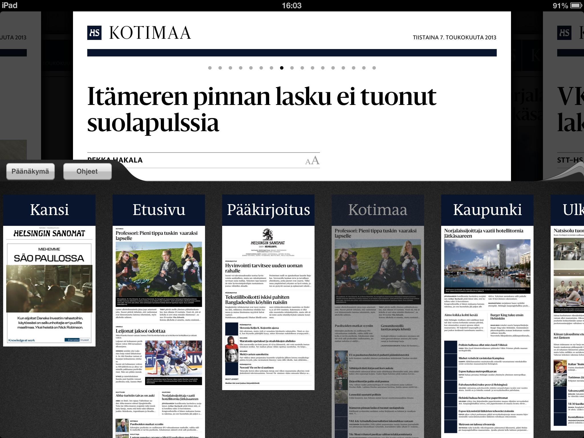
Screenshot of the Helsingin Sanomat
Ribbons seem to be a good way to help the reader navigate inside the application. Craig Mod, an independent writer, designer and publisher writes in an article ‘Simple tools and systems for digital publishing’ that the interaction should be intuitive, effortless and grounding. “The user should never feel lost.” The Finnish newspaper Helsingin Sanomat has created a ribbon that really helps the reader not to get lost, but it fails in storytelling. The attempts to link between stories that belong together doesn’t work and images and graphics are in the otherwise blank side column as small thumbnails.
A good example of using and integrating a lot of multimedia is the Pulitzer Prize –winning digital feature story Snow Fall – The Avalanche at Tunnel Creek. The story is praised for its rich use of graphics, video, animations and photos. The elements of multimedia are integrated into the story, exactly where they belong, not in the end, side or beginning of the whole text, like they so often are positioned, on prefixed positions.
Jill Abramson, Executive Editor of the New York Times said in the World Conference of The International News Media Association last spring that the feature project has had such a strong effect in the New York Times’ newsroom that “snowfalling” has become a verb. It means “to tell a story with fantastic graphics and video and every kind of multimedia”.
A big mistake on tablets has been publishing one-dimensional graphics. A newspaper cannot show multi-layer graphics, while a tablet can, and in fact single dimension
Screenshot of Wired
graphics on a tablet make a screen feel smaller and are hard to read. Both Wired and Snow Fall seem to use multi-layer graphics or animations taking this into consideration.
Many consider Snow Fall as the future in digital storytelling. I would say that as a model for storytelling on tablets Snow Fall is encouraging, but not perfect. It was not originally designed for tablets and thus it is not as intuitive to use on a tablet than on a computer. Many also argue that Snow Fall is a terrible example for newspapers, because it took six months of reporting by a team of professionals. Not all newspapers can afford projects as expensive as that. However, there are already replicas of Snow Fall. For example Guardian Australia’s Firestorm models itself on Snowfall but is better designed.
News companies have to invest in developing applications if they want to find innovative ways of storytelling on a tablet. But it is understandable that they are reluctant to invest in improving a platform that doesn’t bring notable (if any) revenue and whose audience is still relatively marginal compared to the traditional platforms. Nevertheless if media companies are not going to develop their content for tablets, other content providers and search engines – the ‘Yahoos’ and ‘Googles’- will. After that it will be hard to lure the ever-growing tablet audience with old-fashioned apps.
Professionals argue that offering the PDF of a print paper on the tablet will be enough for some of the older generations of newspaper readers. However, it is widely agreed that the format won’t be interesting enough for those who are already really familiar with blogs, social media and interactive Internet games. As the Editorial Assistant of American Journalism Review Caitlin Johnston points out in the American Journalism Review: newspaper readers and their Web site visitors get one year older every year, and legacy outlets are failing to bring in new ones. It’s time to get appy.
Photo credit: The featured image is a screenshot from theguardian.com

Tags: digital, snowfall, Storytelling, tablets, the Guardian, The New York Times